Chinese New Year 2017 Graphic

For this Chinese New Years, I wanted to take a shot at making my own version of a graphic hat captured the year of the rooster.

A quick look revealed a lot of designs that were very stylistic or that only hinted at the rooster partially.  I decided that I wanted to attempt something that utilized the whole number as part of the rooster while retaining the legibility of the numbers.

search

A quick initial investigation on the form revealed to me where I would like the numbers to be and I then began to bring the numbers back to a more legible state.

2017-01-29-15.17.52

Attempting to keep the numbers in a printed font like state proved difficult as the blockiness conflicted with he angles I wanted for the rooster (the upwards angle of the head and neck and of the tail).  I ended up deciding to angle the numbers slightly up at each end to accommodate this.

2017-01-29-15.19.582017-01-29-15.19.11

Then it was onwards to the calligraphy.  Ink is a very punishing medium; without layers and undo buttons, a single mistake on a later stroke can make an entire image trash.  On the other hand, this means that you get a lot of practice, and by the final draft, every stroke is very familiar to you.

As I started, I still needed to play with thickness and dryness of the brush.

2017-01-29-15.20.47

With a bit of workshopping with my friend Dan Lin (https://aeveis.tumblr.com/), here is my final version below.

2017-01-26-19.56.45

Geometry 6/7/2016

FullSizeRender-4

Stared at some ceiling tiles today, which was a bad call for my productivity because I immediately wondered how the contractors cut and installed the cross pieces, and whether or not their was a standardizable piece that allowed optimal tiling.

FullSizeRender-2

So I started with some exploratory thought experiments.  Pieces that have one intersection and one edge can perfectly cover one square (in pink below) so let’s go from there.  Unfortunately as we add to it (green pieces), we create spaces that standard pieces don’t fit into.  A failure.

FullSizeRender

What about a longer pieces that spans an intersection and two edges?  This creates a very familiar weave-like pattern that definitely tessellates (below).

FullSizeRender-3

However, we aren’t close to a generalize-able rule.  Indeed, one could imagine many other strange angled or partial length shapes that I have not tried yet, and I wondered if there were at least some property that influenced their tessellate-ability.

I began to think that it has to do with the number of intersections and edges that a piece crossed since the relationship between those helps to define how much space the cross pieces need to cover.

An inductive analysis can be used: a single tile has 4 corners and 4 edges, then four tiles have 9 corners and 12 edges, and then nine tiles have 16 corners and 24 edges (image below).  This is solvable by looking for the pattern (n^2 corners to 2n^2 edges), but the answer is easier to come to if we simply look at the general situation of each corner and each edge instead.

FullSizeRender-5

In a fully-tiled situation, a corner sits at the intersection of 4 tiles while an edge sits at the intersection of 2 tiles.  There we have it then!  For an infinitely tiled surface, you will need a corner for every 4 tiles, but an edge every 2 – there will then be a ratio of edges to intersections/corners of 2:1.  Thus, this must be a design constraint of the cross-pieces (which agrees with why my second thought experiment worked unlike the first).

While this does not give us a way to define all possible cross piece shapes (one could imagine a complicated cross-piece shape with 74 edges and 37 intersections but does not tessellate), it does allow us to check if a cross piece shape could potentially tessellate.

On Reasons I Like Third-Person Camera

There has been plenty written about why one should make a game in third-person or first-person:  Convention and what your target audience will already be familiar with.  How much you want the player to be immersed as the character in your game.  And so on.  Today, I would like to discuss my biggest consideration: information – as a gamer who likes when UX/UI emphasizes information and clarity, third-person camera appeals to me more.

While first-person camera appears immersive immediately, there is quite a bit of information that it will not be able to capture until VR tech gets further along.  Forefront is touch/proprioception.  In addition to the first-person view I have out of my own head, I can feel where the ground is below me and where a wall is behind or beside me without having to look at it.  Touch/proprioception allows me move comfortably around my environments in spite of my own limited field of view.  With first-person camera however, you can’t tell that you’ve landed on a surface or if you’ve bumped up against a wall unless the camera stops moving or if one your directional movements starts pushing you along something.  It’s not ideal and, at least for me, requires an additional moment of mental processing to figure out what is going on.

Now enters third-person camera.  It does not give us completely natural proprioception of the environment; however, it does allow me to see the floor and the walls in lieu of feeling them.  I can more closely see where my character is in space just as I would feel where they are in space if it were ideal first-person.  In lieu of physically being able to brush up against things, at least I can see where the 3D models touch.  This restores more of my sense of space and allows me to move in the game more reflexively.

I can’t just outright recommend third-person camera.  Of course, when poorly implemented, it can cause just as much frustration.  What I do want to say is that in most cases, when given a choice by a game, I would choose the third-person camera over the first-person camera because it feels more natural to me.  More natural because, though it sacrifices the sense of immediacy and of seeing “through the character’s eyes”, it offers information normally provided by touch/proprioception.

Reflection on Werewolf

I’ve played Mafia, a lot of Mafia, and some of my thoughts are probably anchored based on how those experiences went.  Nevertheless, I wanted to comment on something that stood out to me the most on my first game of Werewolf played on 1/30/2015:

We let every villager have a role. While letting every villager have a role was a nice way to give everyone something to do, I didn’t like it from a game design perspective. Having too many clear roles upset the fuzziness in identity that makes this type of game confusingly compelling.

For example, say there is one werewolf and two villagers left:

If those two villagers had specific roles, say bodyguard and seer, then in that case, the werewolf must claim to be one or the other. However, the person with that card would know that is a lie and it would simply come down to a shouting match between the two.

If on the other hand, those two villagers roles were just “villager,” then the werewolf could claim to be a villager. In that case, both real villagers only know that they themselves are one of two villagers, and could be played against each other by the werewolf claiming to be the second villager.

In the first case, the onus is entirely on the werewolf to process all the information, make an optimal choice, and then try to be the loudest.  In the second case, the werewolf has the choice to be more deceptive, and play both villagers against each other, creating flexibility.

When my group played with too many roles last night, then, it was simply a process of elimination and matching up individual roles with people, which made it easy to solve the game. I found it difficult as a werewolf to pretend to be “part of the crowd” as there was no generic “crowd” to be a part of. Instead the game was about knowing the ideal next steps.

My recommendation would be to play with more regular villager cards but give them artifacts if they want to have unique powers. Having duplicates makes it more difficult to determine who people are and creates more confusion, politics, and intrigue, which is what I believe is the essence of these types of games.

Geometry 1/13/2014

Something that I’ve been trying to figure out what to do with is my affinity for random geometric problems (e.g. staring at a half-covered design on a random pizza box and realizing that the lines of the “pizza slices” do not intersect at the center of the arc in which they lie).

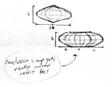
Today, I was pondering over the toroidal map type in Civilization. The game still plays on a planar rectangular projection of the map, but how much distortion should there really be?

I’m going to assume that the width of the map is the maximum latitudinal circumference around the outside, and therefore I am interested in how much narrower the “poles” should really be to meet each other on the inside of the torus.

My initial condition therefore is that [map width] = 2 * pi * ([major radius] + [minor radius]) and that [map height] = 2 * pi * [minor radius].

I am interested in the minimum latitudinal circumference, described by 2 * pi * ([major radius] – [minor radius]).

After some very basic algebra, the conclusion is that the poles should be only as wide as [map width] – 2 * [map height], a significant result! The distortion is quite severe for maps of appreciable height!

If a toroidal Civ map was twice as wide as it was tall, the poles would all still come to a single point, which is not much actual space for units and cities placed up there. Though, if we had to play on Civ maps where distance was physically accurate given the 3D shape of the world, it’d probably be even more confusing to keep track of.

scan_01142014

A not actually very informative scan from my scribbles